Homelessness is on the rise in cities throughout the US. While networks of organizations work to remedy this problem, their focus is expanding beyond mitigation to include prevention measures. To this end, organizations like Understanding Homelessness have created interactive maps of the US that attempt to capture the breadth of the homelessness epidemic. These maps are valuable tools that provide information that allow governments and nonprofits to see where and how people experiencing homelessness live, predict where there might be an increase in homelessness, and target services more effectively.
It is no secret that homelessness is rapidly increasing in some parts of the US. In the last two years the homeless population in California has increased by 16 percent. Government and nonprofit aid programs are helpful but seldom keep chronically-homeless people off the streets. These programs are also expensive: Certain parts of the country spend upwards of $40,000 per homeless individual annually. With preventative measures that aim to provide stable housing, the cost to taxpayers could decrease by up to 60 percent.
Statistics likes these are a critical component of the story that drives public action towards combating homelessness. Data visualizations take that story to the next level, allowing the public to see just how complex and widespread the problem truly is.
So, how can government and nonprofit organizations visualize homelessness? What information could they display that will help inform a better understanding of the causes and consequences? And how can government and nonprofit leaders use that information to tell a more effective story and push for action?
The answer is not easy. It involves numerous social and economic factors, but seeing and understanding where people experiencing homelessness live today and where homelessness is likely to occur can prove to be important pieces of information that any leader will need. GIS analysts at Esri worked with government leaders from LA County to answer these questions with this Story Map (and teach others to do the same with this tutorial).
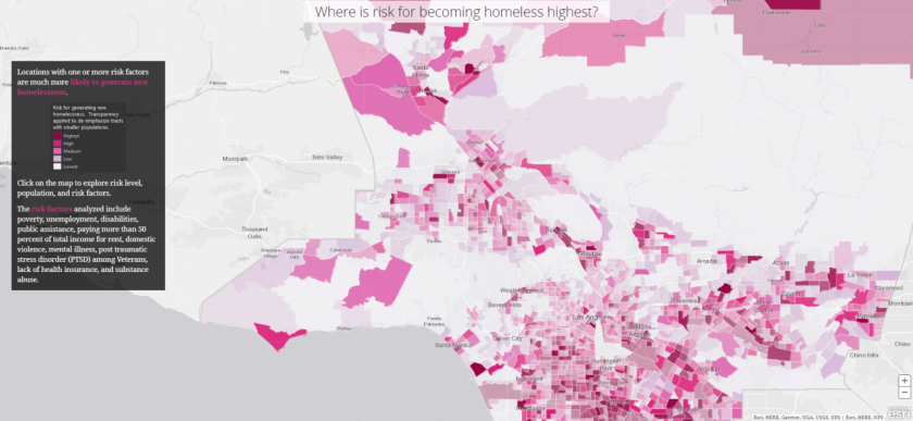
Several mapping projects have attempted to draw attention to key indicators that lead to homelessness including evictions, health disparities, and rent affordability; however, very few maps take a holistic approach to analyze all indicators that lead to homelessness (e.g., poverty, unemployment, disabilities, public assistance, rent burden, domestic violence, mental illness, etc.).
The following map was created by analysts at Esri, which overlaps several indicators mentioned above to see where one or more risk factors increase the risk of homelessness throughout LA County:
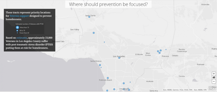
The following maps present a few examples of targeted intervention programs where they would be of highest need in accordance with the risk factors identified previously. They focus on unemployment assistance, affordable housing, and veteran support.


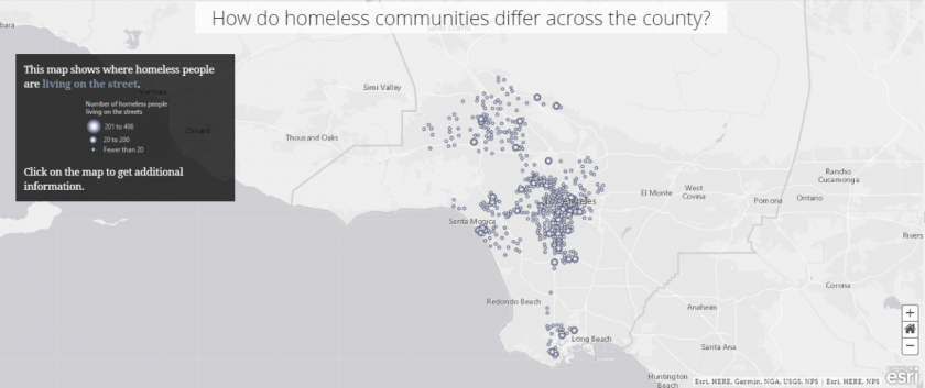
The following maps are a few examples from the Story Map that show the conditions that those experiencing homelessness are living in. They show the highest concentration of unsheltered homeless people; places where people are living in cars, vans and campers; and places where people are living on the street.


The following maps compare five possible solutions for addressing homelessness in LA County as presented in the Story Map:
1. Optimizing Social Equity – This map attempts to measure the equity of resource distribution across the county.


All eyes will be watching LA County in the coming years as new ballot measures passed in 2017 (Measure HHH and Measure H) are implemented, and new targeted services such as those mentioned in this Story Map are applied across the county. In describing LA’s homelessness and approach to addressing it, these maps provide an exciting learning opportunity for other city, county, and state governments.